SILVER WINNER: Ugly Betty — Series 1 Launch South Africa

Client: M-Net
Entrant Company: Mindshare South Africa
Entry Category: A Local Brand or Service in a Local Market with innovative media solutions worthy of international adaptation or of world class standards
Names to be credited with submission:
• Tracey-anne Cobey — Implementation Executive, Mindshare
• Natasha Velen — Brand Manager, MNET
• Candice Short — Account Director, Ogilvy
• Sonya Seegers — Ass. Account Manager, Ogilvy
Time Period of Campaign: 2008
Case Study Summary:
Marketing Situation: The goal was to launch the Ugly Betty TV series on South African screens in an interesting, impactful and engaging way. The specific objectives included achieving 7 AR’s for the first show against the LSM 8-10 Female Pay TV audience, with Males as a secondary audience.
Key Insights: The core media idea was to turn beauty on its head, making “ugly the new beautiful”. This was achieved in two main ways:
1. Identify specific environments that were traditional “spaces of beauty” and place Betty in these same environments.
2. Spark a debate on whether ugly is the new beautiful.
Media Strategy: Traditional media was used in unexpected ways, often with a play on “ugly.”
Betty “has a face for radio…” Radio was the key support medium for Television, driving frequency levels and top-of-mind awareness, particularly closer to the time of launch.
In male titles, the centerfold & “back page babe” were identified as key “spaces that showcase beauty”—then turned into the Ugly Betty surprise. South African Sports Illustrated featured a belly band wrapped around the back page babe, leading to an Ugly Betty “Center Spread.” Zoo and FHM also featured center spread placement, with Betty in a provocative pose.
The female market required more care, as the word “ugly” is taboo, especially in today’s body conscious, beauty-driven world. Instead, Ugly Betty ads spoofed beauty brands such as “Maybelean” – “Maybe she’s born with it; Maybe she’s just not born lean.”
Billboards are traditionally used by the big beauty & fashion brands, especially large format super-signs. This medium was selected for big brand impact with Betty’s face unashamedly plastered all over town.
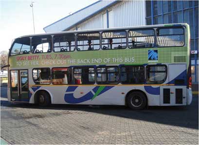
The thought behind bus branding was the adage “as ugly as the back end of a bus…” This was adapted slightly with “Ugly Betty, to see her check out the back end of this bus.”
Bathroom mirrors were branded at cinemas. The viewer had to look through a pair of Betty’s Iconic glasses, and see Betty’s braces. The “viewer” seemed transformed into a version of Betty.
How Could this be a Template for Other Campaigns or for World Class Standards? Innovation in this situation resulted from the media strategy guiding the creative agency. The campaign’s success was based on using certain expectations of traditional media in an unexpected way. This created “talkability” for a campaign without a significant budget.
Results: The first show outperformed the target AR’s by 43%.
The campaign generated buzz, curiosity and considerable consumer comments, such as: “I drove past one of your Ugly Betty buses today in Rosebank & noticed a couple of people craning their heads to try and see her on the back of the bus… I found this really amusing.”
|

